April 15, 2016
Rose Quartz & Serenity
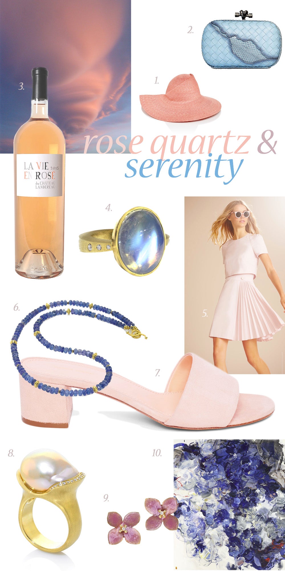
A delicate pairing of warm “Rose Quartz” pink and cool “Serenity” blue, Pantone’s 2016 Colors of the Year create a fresh and soothing palette, especially fitting for this time of year. These hues just feel like a sip of rosé on a patio under cotton-candy clouds — ahh Summer! Our festive enthusiasm aside, Pantone’s choice in color reflects a sense of order and peace, blurring the line between opposites.
In many parts of the world we are experiencing a gender blur as it relates to fashion, which has in turn impacted color trends throughout all other areas of design. This more unilateral approach to color is coinciding with societal movements toward gender equality and fluidity, the consumer's increased comfort with using color as a form of expression, a generation that has less concern about being typecast or judged and an open exchange of digital information that has opened our eyes to different approaches to color usage. (Pantone)
The colors not only convey positive energy, they look beautiful together too. Here’s our take on ways to get more of this lovely palette into your life…

3. La Vie En Rose du Chateau Landereau via
Total Wine
Leave a comment


